


Having a mobile-friendly website is essential in today's world. It ensures smooth functionality across smartphones and tablets, allowing users to navigate pages and read content without frustrating zooming or long load times.
With over 60% of global web traffic coming from mobile devices and Google using mobile-first indexing, businesses that neglect mobile optimization risk losing visibility and users. A responsive design is key to delivering a positive user experience and maintaining strong SEO performance.
In this blog, we explore why a mobile-friendly website is essential for delivering seamless user experiences, improving SEO rankings, and staying competitive in today’s mobile-first digital landscape.
11 Best Practices to Make a Mobile-Friendly Website
Businesses should advance mobile optimization further than render their sites appealing on mobile screens. The listed 11 procedures enable you to construct a fast, responsive website that delivers a user-friendly experience across all devices.
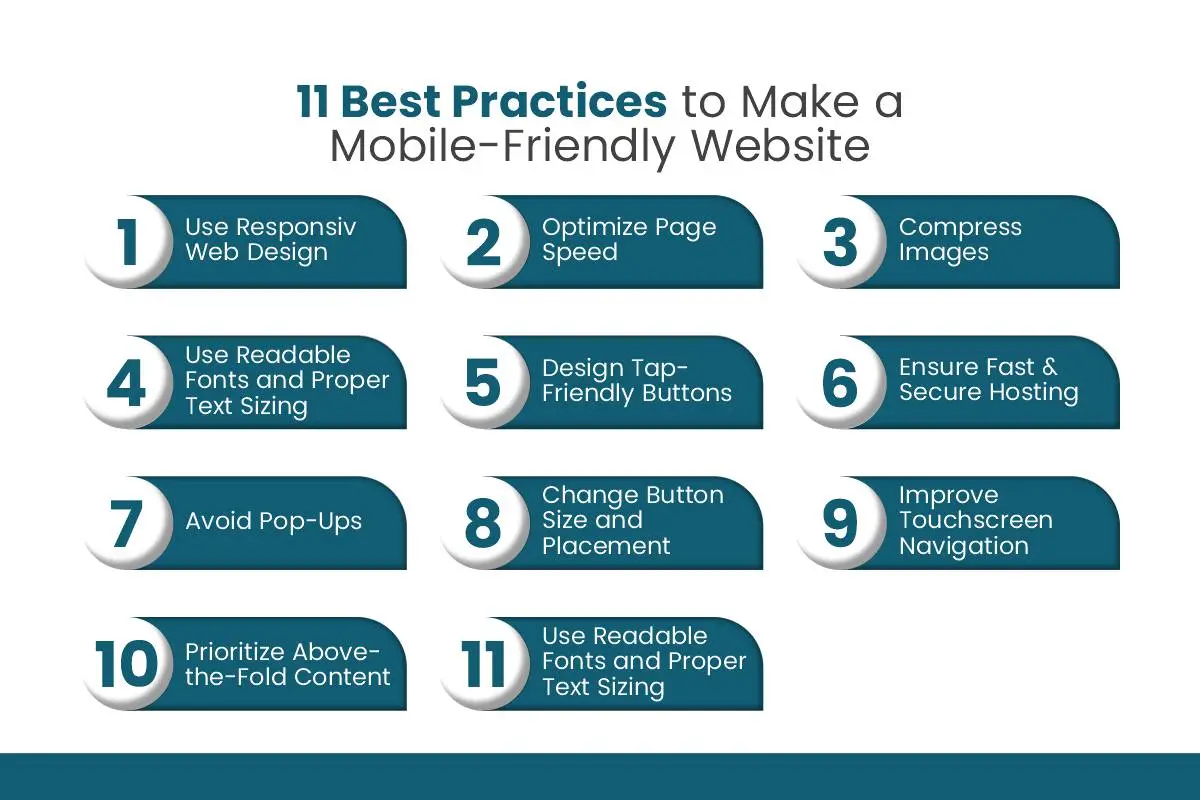
Research conducted by the industry provides backing for these strategies, which follow the mobile guidelines set by Google. Let’s explore them in detail.
1. Use Responsive Web Design
A responsive web design automatically modifies and restructures site layout to match different display sizes of devices. Your website provides uniform user experiences across mobile phones, tablets, laptops, and desktops because it does not require distinct versions.
Excellent user navigation with platform accessibility emerges from responsive design features like flexible grids and images coupled with CSS media queries. Google supports this approach to website design because it enhances SEO while cutting down maintenance work on distinct mobile and desktop sites.
2. Optimize Page Speed
When visitors encounter delays on a website, it becomes annoying because they anticipate immediate content appearing on mobile devices. The Google report indicates that site visitors commonly leave webpages that require more than 3 seconds to load on mobile devices, hence, page speed demands optimization.
Your page speed improvements require minimal server times, combined with content delivery networks and the elimination of redundant JavaScript code. The speed of your pages enhances both user involvement with your website and positions you better in search engine results.
3. Compress Images
High-resolution images, which appear impressive when viewed, become a negative factor for mobile network speeds. Your site's smartphone performance will improve because image compression keeps your page loading speed fast, regardless of picture quality degradation.
WebP image formats, along with compression tools such as TinyPNG or ShortPixel, enable automatic photo file reduction. The addition of lazy loading will delay image loading until users reach specific areas on the page, thus decreasing bandwidth usage to improve performance.
4. Use Readable Fonts and Proper Text Sizing
Small or decorative fonts that are used become hard to read when displayed on mobile phone screens. A font choice that enables easy legibility, along with an absolute minimum text size of 16px, helps both users who squint to see the content and those who need to zoom in for clarity.
Consistency in typography also matters. The text-background color ratio should remain balanced, as headings together with proper spacing between paragraphs will aid users in breaking down content into manageable pieces when reading mobile content.
5. Design Tap-Friendly Buttons
Instead of using mouse pointers, mobile devices function using finger gestures from users. Design buttons and clickable elements with an adequate size and appropriate distance between them because this prevents unintentional taps.
The standard rule for touch-friendly targets should be 48x48 pixels minimum size with enough buffer zones around touchable areas. The design improves both usability and accessibility, mainly for users who need a larger font size or smaller screen dimensions.
6. Ensure Fast & Secure Hosting
Speed and reliability of web hosting play an essential part in achieving quick mobile user experiences. A server that functions slowly, regardless of website optimization, will cause page loading delays.
HTTPS encryption provides users with security through data protection alongside the ability to develop trust in a system. The adoption of HTTPS by Google makes it mandatory for websites to use secure hosting services because it serves as a performance and SEO ranking criterion.
7. Avoid Pop-Ups
Mobile users experience extreme displeasure from intrusive pop-ups because they usually take over the full screen and disturb the user experience. The penalization system from Google hits websites that use disruptive interstitials that block user access to content.
Users will appreciate non-intrusive marketing solutions that include slide-ins displayed below the screen area. The features enable contact communication and lead acquisition through methods that do not interfere with mobile-use usability.
8. Change Button Size and Placement
Button layout on mobile screens has a bigger influence than position on user navigation. Different-sized buttons that grow to an easily tapable size should reside at thumb-reachable thumb positions centered beneath the screen.
The arrangement of important buttons should maintain adequate distance from one another to prevent mistakes. A slight change in button dimensions will dramatically enhance both mobile sales and minimize navigation difficulties.
9. Improve Touchscreen Navigation
Users who access websites through mobile devices need to use gestures and touch functions for website navigation. Online users need your design to support natural touchscreen functions including slideable carousels as well as collapsible navigation structure, while offering simple touch-based scrolling abilities.
Tests should verify that your menu items and form fields, together with links, function flawlessly through touch input, while hover effects that fail to work correctly on mobile phones should be avoided.
10. Prioritize Above-the-Fold Content
Users viewing your website through mobile screens receive limited visibility, so you must focus on what should appear first in their view. Your most critical content, including CTAs together with value propositions, should occupy the above-the-fold zone to capture viewer attention instantly.
Improving user engagement and preventing user abandonment becomes possible by following this approach. When the initial page design is compelling, in the fold section, many website visitors continue down into deeper content areas.
11. Avoid Fixed-Width Layouts
Static width layouts present problems when different screen dimensions are used since they often trigger horizontal surfing alongside element warping and breakdowns. The issue becomes worse on mobile devices with small screens.
Make the switch to fluid grid systems that help content stretch properly based on display size. Your website structure and usability remain intact regardless of the device used because of this method.
Why Mobile-Friendly Websites Matter?
The implementation of these best practices will lead you to detect meaningful improvements that generate direct impacts on your business achievements.
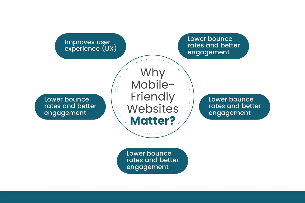
Here's why mobile-friendly websites matter:
- Improves user experience (UX): Your users gain a better website experience through mobile friendliness because it gives them quick navigation of content while enhancing its speed and accessibility on phone screens.
- Boosts search engine rankings: Your website's search engine ranking increases through mobile optimization because Google bases its indexing decisions on mobile usability first.
- Higher conversion rates: Improved experiences and faster page loading enable mobile-friendly sites to receive more conversions as well as more sales and leads.
- Faster page load Times: User engagement improves by executing speed optimization on mobile devices because it calms website load times, which leads users to remain longer while browsing more pages.
- Lower bounce rates and better engagement: Your brand loyalty will grow long-term by running a smooth user experience with easy navigation paths and clear interface designs that minimize users leaving unexpectedly.
Conclusion
In an increasingly mobile-driven world, building a mobile-friendly website isn’t just about aesthetics, it’s about performance, usability, and long-term growth. Following the best practices shared above will help you deliver a seamless experience to every visitor, no matter what device they use.
Keep in mind that mobile optimization is not a one-time task; it requires regular testing and updates. Tools like Google’s Mobile-Friendly Test and PageSpeed Insights can help you monitor and improve performance continuously.
Ready to take action? Check your website’s mobile performance today and start creating experiences your users will love!